
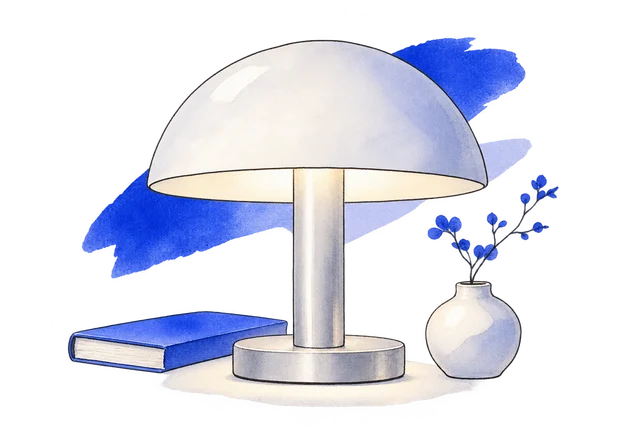
Light has a new shape
We built the product campaign around a cobalt identity and an oversized typographic introduction.
View the screen ↓
We built the product campaign around a cobalt identity and an oversized typographic introduction.
The object page then provides the specification, with the release journal giving the edition its own context.
A launch needs more than a striking opening image. Someone considering the first edition needs product information and a way to understand what changes over time.
We separated product exploration from the first-edition request. That allows the campaign to be expressive while keeping availability and release information in a place a visitor can revisit. The result is a small product site with depth beyond its opening image.
The build brings light has a new shape, n01 table light, first edition and release notes into one website.
We built the product campaign around a cobalt identity and an oversized typographic introduction.
View the screen ↓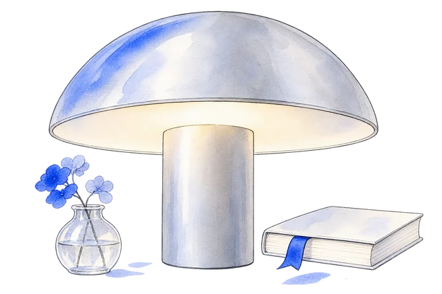
A curved shade catches the daylight. When evening arrives, the underside becomes a warm, intimate source of light.
View the screen ↓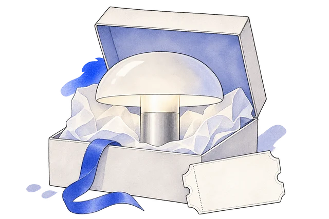
Join the first chapter. Explore an example reservation before the object moves into production.
View the screen ↓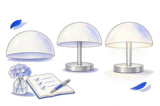
Good things take a little attention. Here is where the first edition stands.
View the screen ↓Explore the website, from the first impression to the finer details.
Choose a view to enlarge ↓Tell us what your customers or team need to do. We can help define the pages, records and interactions around that task.


