Meet the setting.
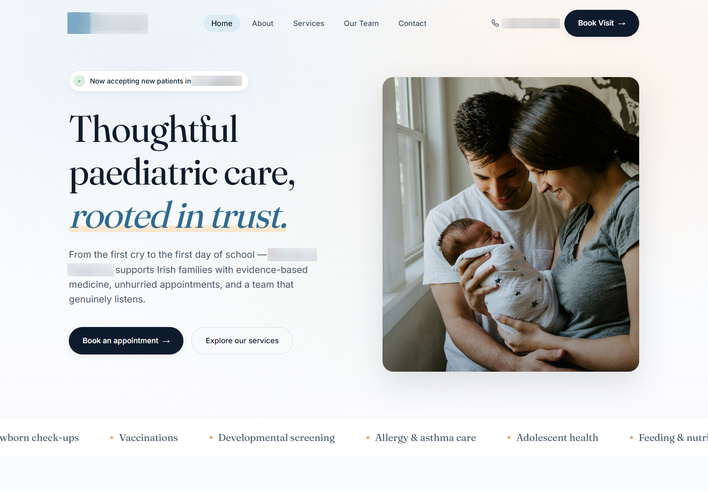
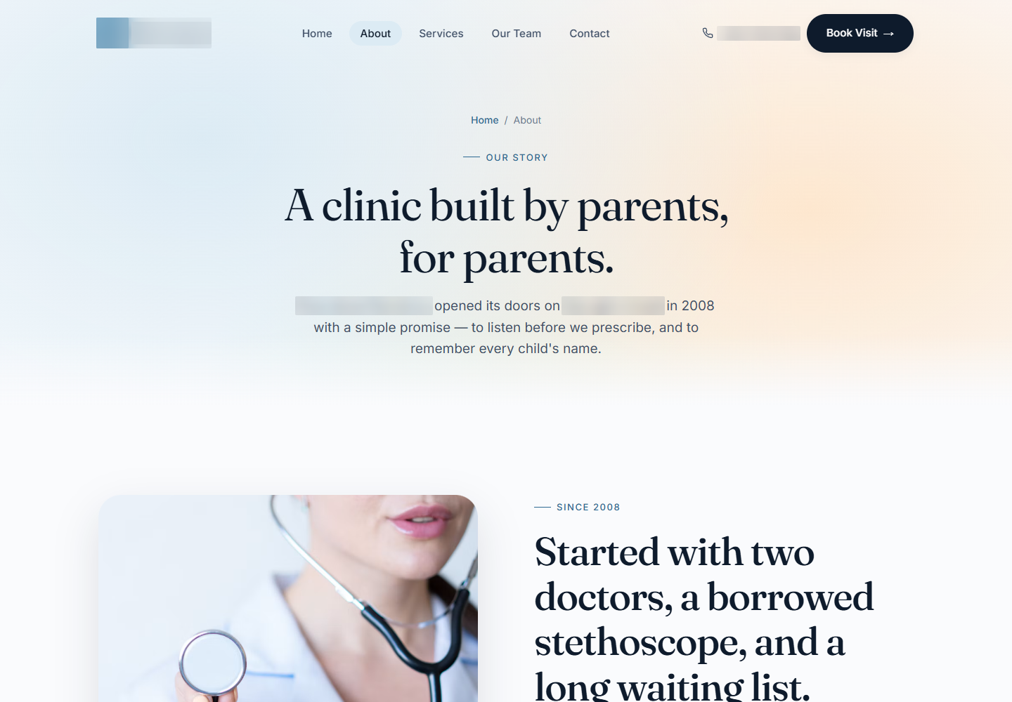
Introduce the practice with family-appropriate imagery and accessible page structure.
A pediatric website that brings services, clinicians and appointment preparation into a calm, family-facing experience.
We designed the information around a parent's practical questions, then carried that clarity into a structured appointment request.
Explore the work ↓A welcoming website still has to explain who the practice sees, what it offers and how to request a visit.
The information has to be easy to find when someone is planning around work, school and a child's needs. We gave the practice, services and clinicians separate destinations within a six-page site.
Warm photography and a measured hierarchy establish the tone. The appointment flow handles the practical detail, gathering preferences in stages instead of presenting an undifferentiated form.
The site connects the human introduction to the information needed for an appointment request.
Introduce the practice with family-appropriate imagery and accessible page structure.
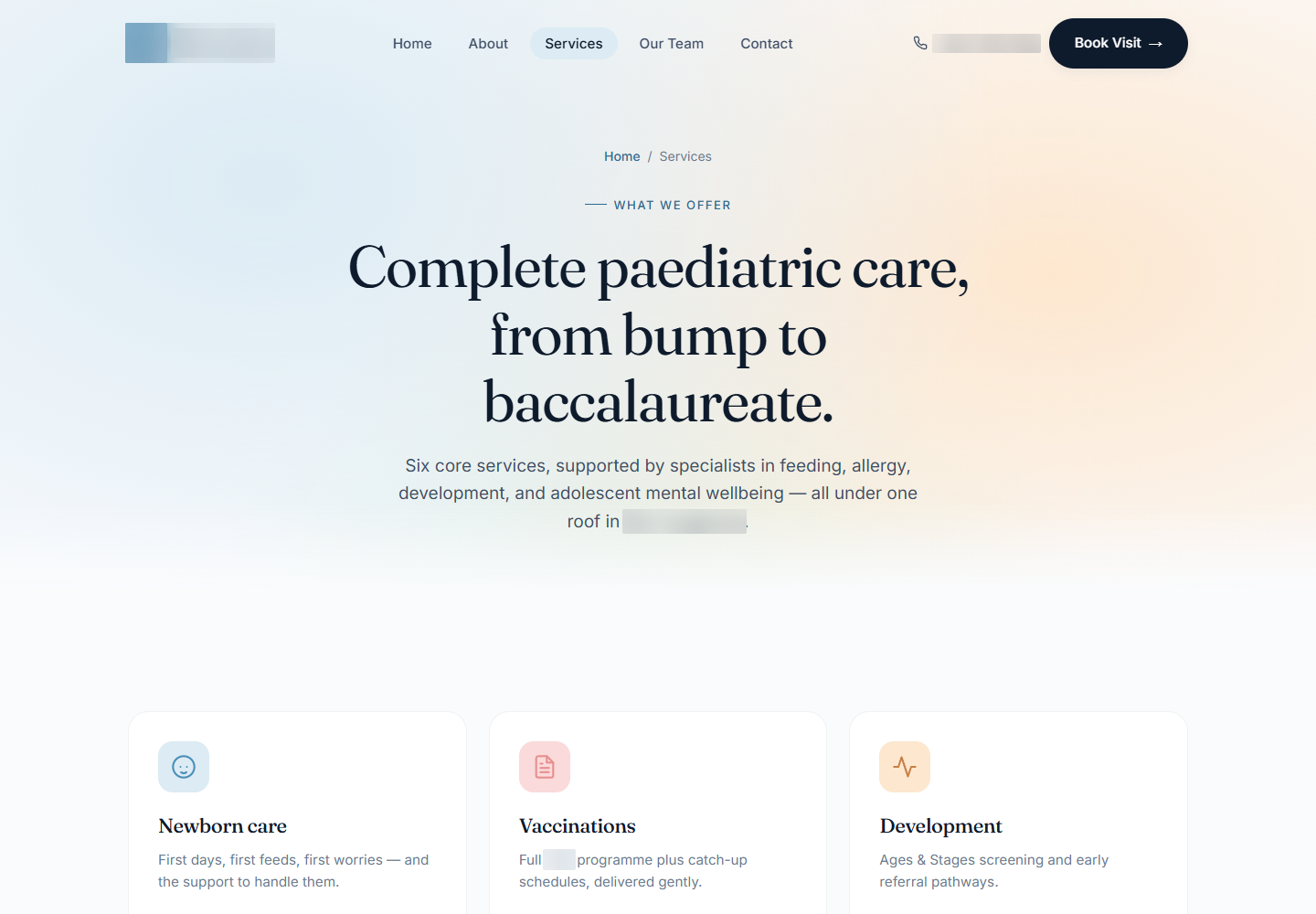
Give the areas of care their own space, connected to the main navigation.
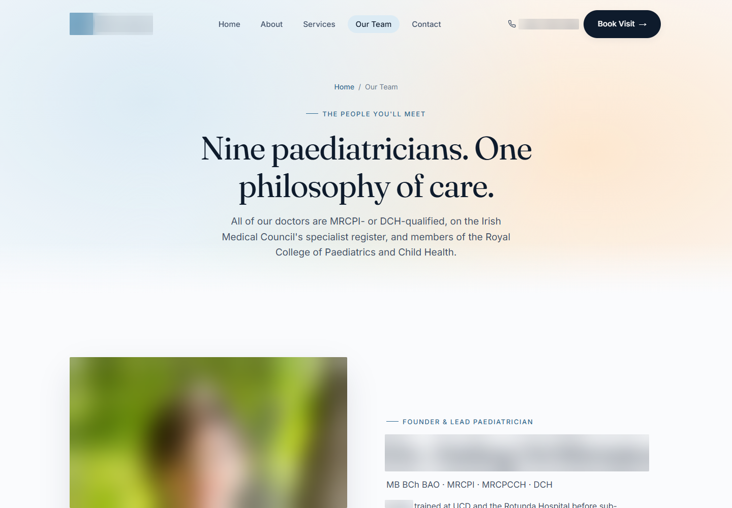
Present the people behind the practice before asking for a clinician choice.
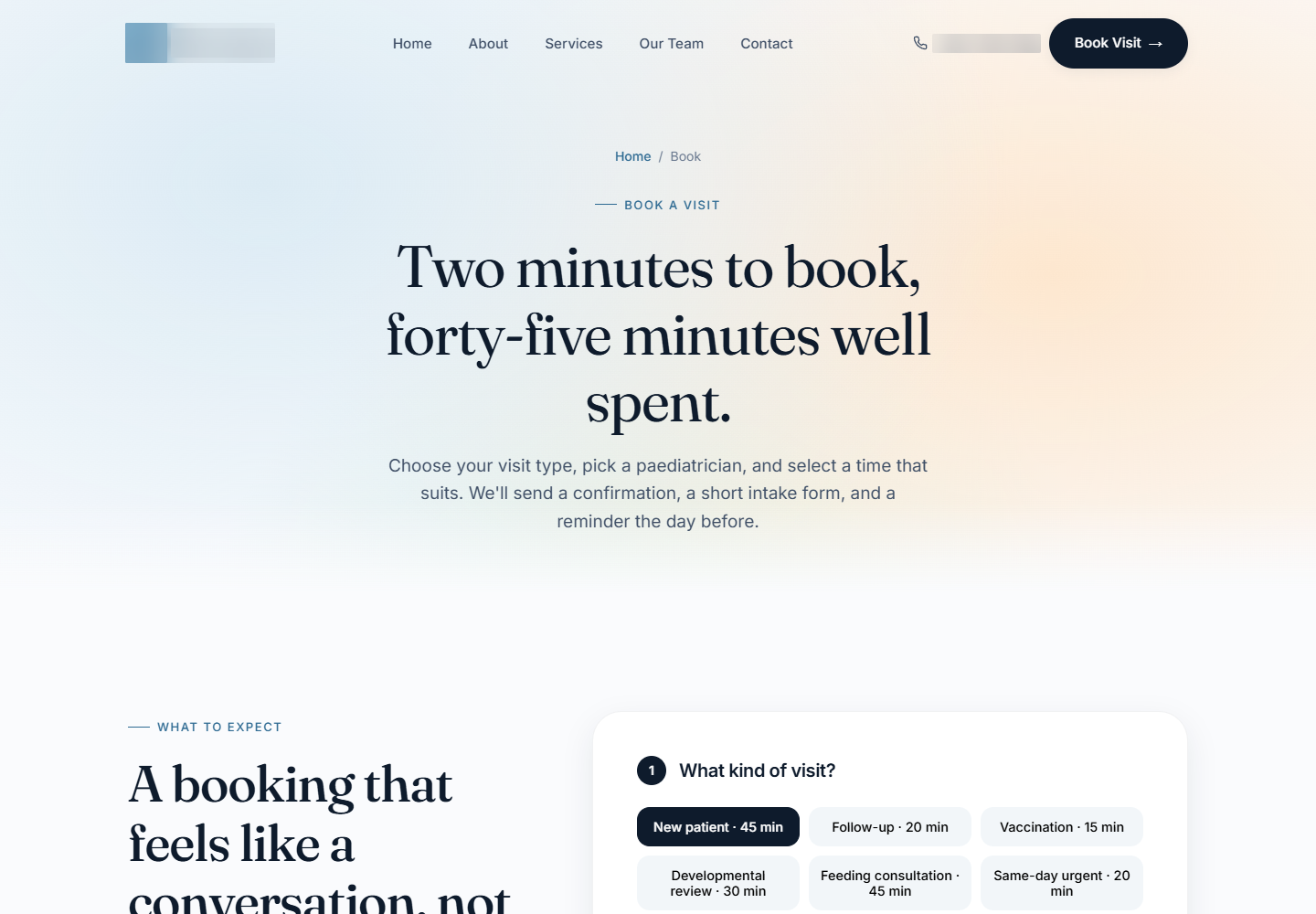
Gather visit type, clinician preference, date, time and contact information in stages.
The appointment request needed an unambiguous selection. We replaced the fixed-day interaction with a date input and a single group of time choices, keeping one selected time at a time.
The controls also needed to communicate their state. Selected slots use an explicit pressed state, unavailable options remain disabled, and the choices can be operated with a keyboard. These details make the request easier to complete and review.
A staged form helps people focus, but it spreads the information across several screens. The final summary brings the visit preferences and contact details back into one view.
We made that summary available to download so the request can be retained. The language and flow describe an appointment request, keeping the distinction between a preferred slot and a confirmed appointment clear.
The website connects practice information to a structured interaction without losing its family-facing tone.
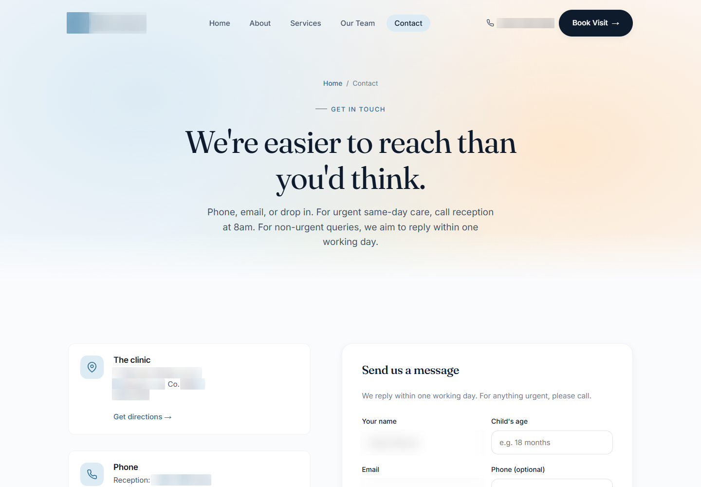
Services, clinicians and booking each have an identifiable place in the site.
Date and time inputs capture a single preference with keyboard-operable choices.
The summary makes it possible to inspect details after moving through the stages.
Six-page pediatric website with service and clinician information, staged appointment preferences and downloadable request summaries.
Start with the home page, then explore the details. These are screenshots of the original website, with names, contact details and identifying information blurred for privacy.
6 views Select any view to exploreWe design service websites that combine a thoughtful introduction with practical, understandable interactions.