
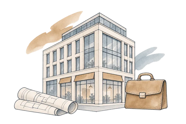
Introduce the firm.
Use an editorial opening to establish the commercial-property focus.

A commercial real-estate website that brings property discovery and advisory services into a shared editorial identity.
We gave the firm and its listings distinct roles in the experience: explain the expertise, present the available opportunities and make a focused enquiry possible.
A commercial-property website has to present both the asset and the people who can help someone assess it.
Listings need a clear, repeatable structure. Advisory services need room to explain a broader relationship. Combining them without a hierarchy would leave both competing for attention.
We built the pages around the firm, its services, properties and contact. Architectural imagery and restrained typography connect the pages, while dedicated destinations let a visitor explore either the advice or the property collection directly.
The navigation supports two related interests: understanding the advisory offer and examining a particular kind of commercial property.
Use an editorial opening to establish the commercial-property focus.

Present advisory services separately from the individual listings.
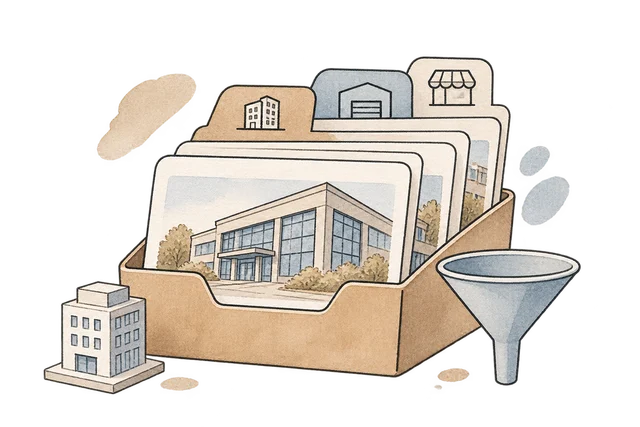
Use a consistent property-card structure with category-based filtering.
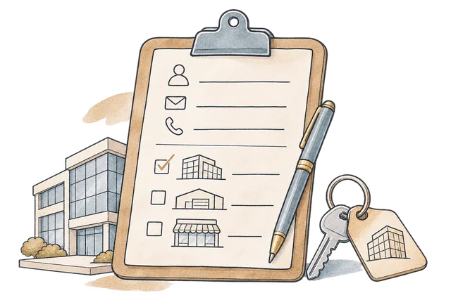
Bring the visitor's contact details and property interests into a request they can review.
We treated the listing card as the basic unit of the collection. Photography gives an asset its identity, while a shared arrangement of labels and details makes the wider range easier to scan.
Category controls narrow the visible listings without taking the visitor into another page. The collection can be explored at a broad level first, then reduced to the property type that matters to the enquiry.
The property collection sits within an advisory website, so the enquiry is part of the experience rather than an unrelated form at the end. Services and firm information remain available as visitors assess the listings.
We changed the contact interaction to assemble a readable request for review and download. It preserves what the visitor entered and makes the handoff explicit, without presenting a local form interaction as a delivered message.
The finished front end gives the firm a consistent presentation and the collection a practical structure for discovery.
Large imagery, measured spacing and editorial type connect the service and property pages.
Advisory services and property discovery remain distinct, accessible destinations.
Category filters help visitors reduce the collection before preparing an enquiry.
Explore the website, from the first impression to the finer details.
Choose a view to enlarge ↓We build property and professional-services websites that give the collection structure and the advice a clear place.


