
Set the tone.
Introduce a shared hospitality identity through photography, typography and a consistent visual rhythm.

A hospitality website that gives each property its own character while making the collection easy to explore.
We paired an editorial presentation of places with regional discovery and stay planning, carrying one identity across the collection.
The property is the destination. The collection is the promise that connects it to the others.
A hotel website has to hold both ideas at once. Large photography can establish atmosphere, but guests still need to compare locations and understand what a stay might involve.
We built a structure for the collection, properties, journal, membership and contact. It gives discovery a practical backbone while leaving room for the slower, more evocative material that makes a place worth considering.
The experience moves between editorial browsing and deliberate planning. Neither needs to carry the whole journey alone.
Introduce a shared hospitality identity through photography, typography and a consistent visual rhythm.
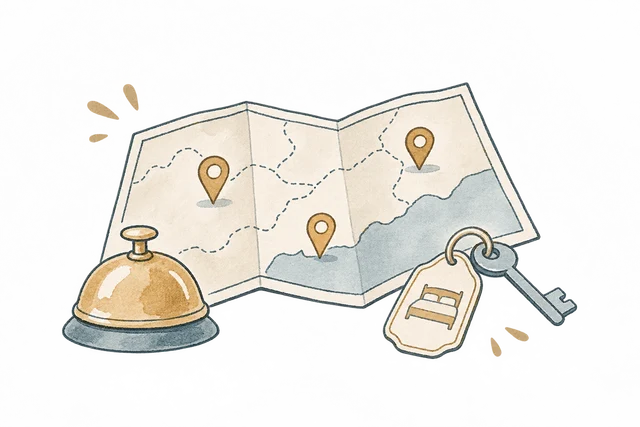
Use regional filters to make a varied collection easier to explore.
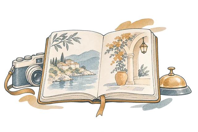
Give destination stories a dedicated editorial space alongside the property catalogue.
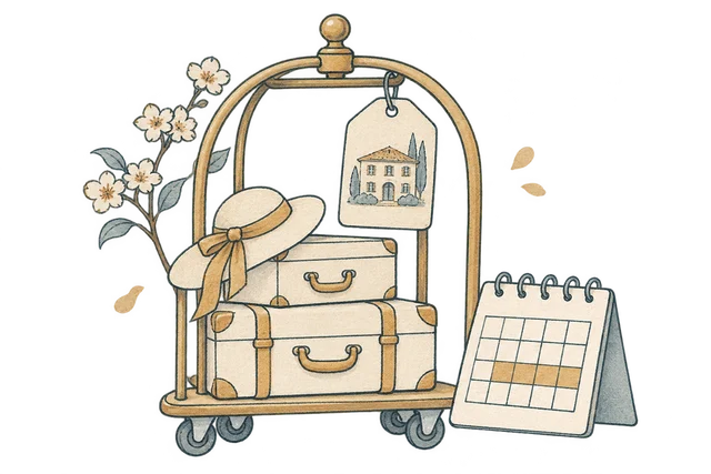
Bring property, season and length of stay into an estimate.
The properties need room for different settings and moods. We used a shared card structure, regional labels and consistent typography so those differences sit inside a recognisable system.
The region filter provides a direct way into the collection. Guests can narrow their view without losing the visual context that drew them in. Editorial pages use the same identity, keeping the journal connected to the places it describes.
Length of stay and season change how a guest thinks about a trip. We brought those choices into the estimate instead of presenting a price detached from its assumptions.
The calculation responds to property, nights and season. An enquiry summary then gives the guest something they can review and keep. The enquiry summary keeps the selected property and stay details together.
The finished experience brings editorial hospitality design and catalogue interaction into the same website.
Photography leads the experience, with quieter typography and navigation around it.
Regional filtering gives a practical route through properties without flattening their identities.
The stay estimate makes property, duration and season part of the conversation.
Explore the website, from the first impression to the finer details.
Choose a view to enlarge ↓We design hospitality websites that give individual destinations character and the wider collection a clear identity.


